New Site/fixed
Jump to navigation
Jump to search
- when the page is the smallest (horizontally), the "Download" buttons on the main page should be ensmallerizied, else they word wrap (on an iphone)
- while we're at it, i'd like to re-visit the header again. i'd like it to crush up to a smaller vertical height when the user scrolls down. smallest possible, actually. i realize this may take some time and heavy coding. let me know if you think that will get too expensive. like this:
- can you colorize the product names on the Purchase page, like they are on the Downloads page?
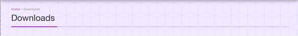
- Breadcrumb Bar:
- i have moved the site up one level to the root, and all seems well. i had a directory called "downloads" already, however, and i need to keep it, so i renamed the "downloads" page to be "product_downloads". this unfortunately seems to have re-established the "breadcrumb bar" (which now has little circles instead of hexy-squares). can you explain how you got rid of it so i can do it myself? i tried a couple things, didn't work.
- i would like to ADD the breadcrumb bar to the top of this page, how do i do that?
- i have moved the site up one level to the root, and all seems well. i had a directory called "downloads" already, however, and i need to keep it, so i renamed the "downloads" page to be "product_downloads". this unfortunately seems to have re-established the "breadcrumb bar" (which now has little circles instead of hexy-squares). can you explain how you got rid of it so i can do it myself? i tried a couple things, didn't work.
- at the top of the page, when you are NOT logged in (ergo there is no WP tool bar), you can see thru the header. can you make that opaque white? or tell me where to fix that
- i notice that the SEO widget for the main page gives me this report
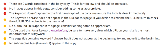
- i'm concerned that using "carousel" text is invisible to SEO?
- clearly there are a LOT of words on the main page, but they all appear inside a carousel.
- what's the story there? also, it says there are no images?? can you explain that?
- will google see the text and images?
- the keyword definitely appears but is apparently invisible
- should i put "software" into the URL?
- why are "outbound links" considered good for SEO? should i add some? to where?
- why do i need subheadings too, for SEO?
- anywhere the product name is shown (via template), it should link to that product's page.
- main page: the three products
- downloads: each product name
- Purchasing: same thing
- i attempted to fix this myself by doing this:
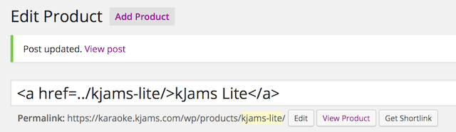
and it LOOKS correct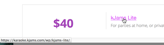
but the title of the page is all htmley: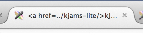
- on this page i want the "twist and shout" image to have a link, ie: if you click the image, it takes you to that link, in this case, it should link here
- on downloads page
- regarding the download buttons (both main page and downloads page)
- update: let's get rid of the pictures, and just make it look like the "Purchasing" page table
- update2:
- remove the prices
- must have method to specify that a product NOT be included in this table
- one download button per section (could be to left or right of product name)
- button knows which platform you're on, provides correct download
- button takes the link from the Products page (where i can edit it)
- button tracks outbound links with google analytics
- right arrow leads to product page just like the table in the Purchasing page
- regarding the download buttons (both main page and downloads page)
- main page:
- buttons track outbound links
- Site Wide:
- scrolling: we should really just fix it, but include the sticky header
- if you click anywhere in the "Site Header" the link goes to the documentation wiki. how do i edit where this link goes?
- update: i mean, how / where do i edit this myself?
- main page
- i know i asked you to sort of "top justify" the pic on the right, but user feedback indicates it should be vertically centered just like the blurb text to it's left. please don't just do it, but instead tell me how to do it myself?
- update: "You would need to add a class", okay i got lost. go ahead and just fix this
- how / where do i specify the background color behind the background picture? i.e.: if you make your browser window VERY wide, you currently see a "gray" behind the background picture.
- update: "#home-featured {background: #000;}" I added this in the two places i found where indicated, but it did not work. still gray (tho now it seems a graduated fill)
- i know i asked you to sort of "top justify" the pic on the right, but user feedback indicates it should be vertically centered just like the blurb text to it's left. please don't just do it, but instead tell me how to do it myself?
- Downloads page: at the top, in the "Additional Info" section, i tried to colorize every other section myself, but failed? It should look like the testimonials section on the main page
- Site Wide:
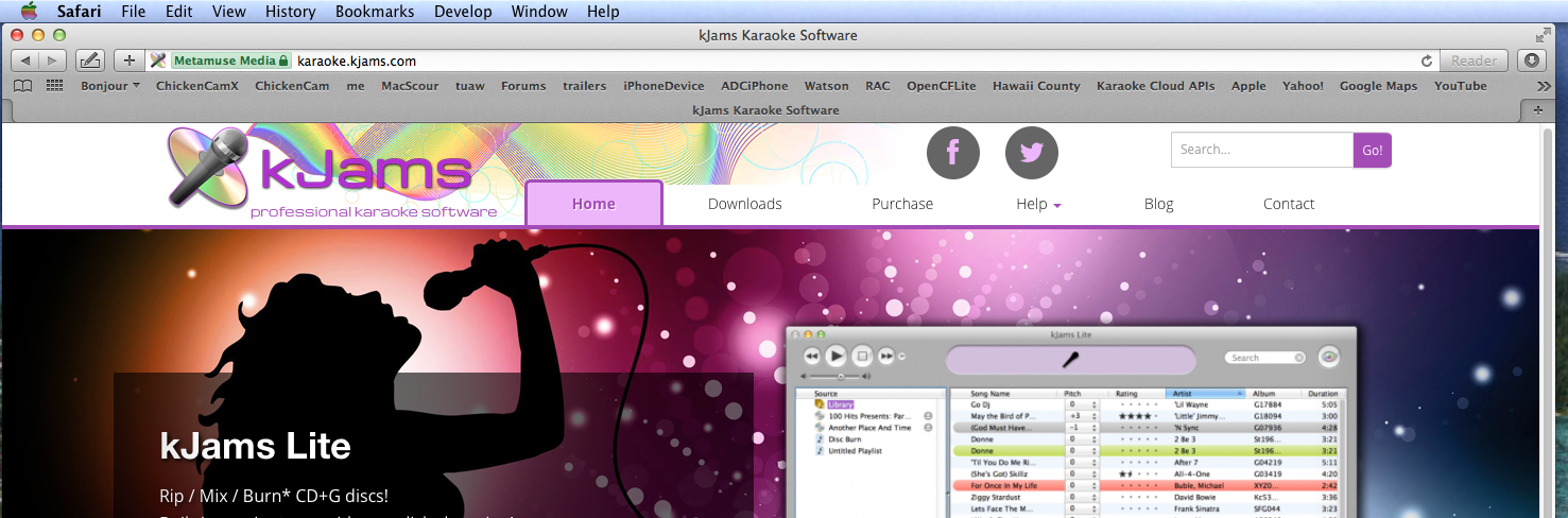
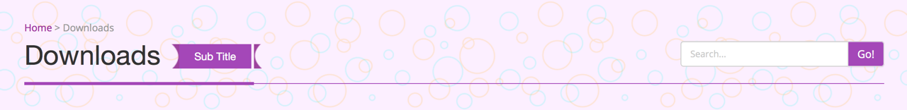
- for lack of terminology, i'm going to dub the rainbow header the "site header" since it appears on all pages, and then there's the "page header" which only appears on SOME sub pages, like this:
- the "page header" has a second search bar, can we get rid of the second search bar?
- if it is the "page header" that is causing the scroll-jump, then if you remove it entirely does it help? otherwise just leave it.
- how can i edit site the header (rainbow pic, icon etc) html or css or WYSIWYG?
- do we have a tool to discover all relative vs. absolute links? is there a plugin for that?
- for lack of terminology, i'm going to dub the rainbow header the "site header" since it appears on all pages, and then there's the "page header" which only appears on SOME sub pages, like this:
- main page
- i'd like to add a single blurb of text under the "testimonials" section (inside that section, but centered, not in a box) that says "Click here for more testimonials" or something, linking away. Again don't do it for me, but tell me how to do it.
- editing the "feature slider" text is very difficult given that the WYSIWYG editor does not account for the "font awesome stars" at the beginning of each line. It seems i am forced to edit the raw text regardless. is there a way to just edit plain text and enter “” () at the start (the FA character for "star") and be done with it? i could not figure it out. seems even in my wiki text the FA char does not show up when you just enter the unicode char for it. Note that it works to just paste the FA char in other places (like the downloads page buttons)
- on downloads page
- i attempted to move the "mp3" and "platform specific instructions" sections up, using the WYSIWYG editor, but have clearly eff'd it up pretty badly. the editor is not what it claims to be, unfortunately.
- i attempted to add a new product at the bottom, but it is not aligned. q: if this editor is not in fact WYSIWYG is there one that is? I don't want to have to keep asking you why there's a problem, it should be easier for me to edit these pages, is there some better plugin we can install to make page editing more "it just works" ?
- this page has you uploading a file. But i just want a permanent hyperlink. (eg: i upload the files to the file system and the link already points to the new file)
- update: fixed. great! how do i: remove a row?
- update2: there is a "minus button"
- how do i change the row header word "Version" to "Edition"
- it has been changed. however, i still don't know how to do this myself
- how do i add another "Edition" to the menu (eg: "MP3 Encoder")
- update: fixed. great! how do i: remove a row?
- do we have a tool (like dream weaver) that shows all links and if any are broken?
- no
- update WP to latest version, update all plugins to latest, ensure they all work
- update: there are still 4 updates available (1 plugin, 3 themes), do we need these? if not how do we say "don't notify me of these updates, thanks"?
- update2: the three themes are not updated. can we update them? if we should NOT update them, how do we hide them from the updater?
- update3: up to date now. you're on your own for future updates
- i tried updating the background picture from here, however it does not update the picture when you size the web page smaller, it goes back to the old image. this is why i thought there was a cache or something. how do i update these "smaller sizes" as well?
- update: The background image on the homepage slider now updates. but why did it not update in the first place? is that problem permanently fixed if i update the pic again?
- update2: won't happen again
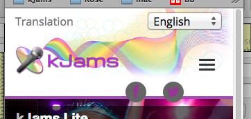
- the language chooser popup menu shows the word "translation" left justified on the page, and the menu right justified, as if they have nothing to do with each other?
- update: fixed
- Download buttons are a little off-kilter:
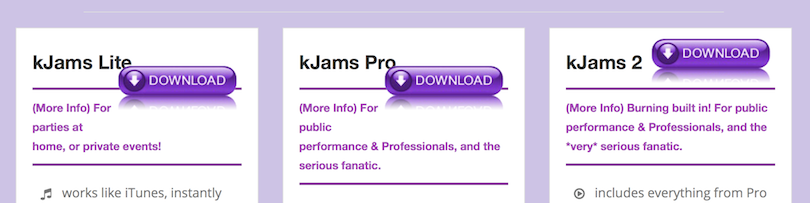
- we could possibly say "Lite", "Pro", and "2" to give a bit more room to the right of the text?
- update2: all fixed
- is it possible to bottom justify the text blob on the main page ("slider")?
- update: here's a pic:
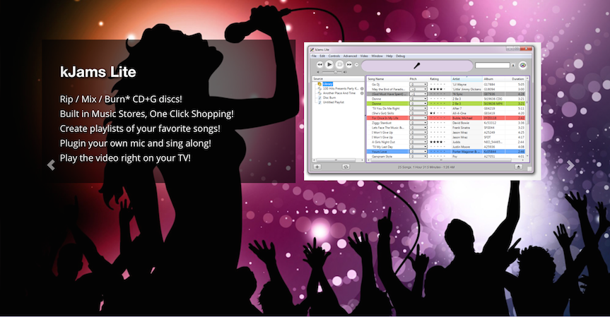
- the text box is toward the top of the background picture, is it easy to specify that it lean more toward the bottom of the background? and if so, please also tell me how to change it myself. so if i change the picture again and say i need it top justified again...
- update3: it's sortof middle justified now, which is fine
- update: here's a pic:
- how do i edit the section name "Features Close Up" to e.g.: "Explore kJams"
- update: it is changed, but i actually want to know how to edit it myself
- update2: it has a GUI editor now
- some "font awesome" glyphs do not work, for example "fa-music" on the first point of "kJams Lite". Perhaps the FA stuff needs to be updated to the latest?
- update: fixed. but how do I fix this myself, if it happens again?
- update2: won't happen again
- how do I clear the cache?
- update: there is no cache
- When i go to this page to edit, scrolling down to the "Feature Slider", the text edits are all raw html, can we turn on WYSIWYG editors there?
- social buttons color: currently it's gray on gray. can we have them be pink on gray (same color as active tab background)

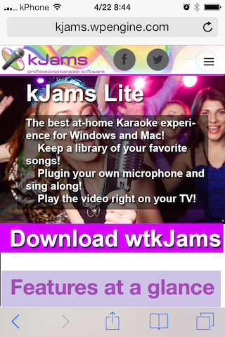
- get rid of the selection "drop down menu" and the "download" button. instead, insert three separate buttons "Download Lite" "Download Pro" "Download 2"
- update: well, i'll do some user testing and see what the users say. i think i'm okay with it as is, but let me get back to you
- update2: we realize the "download" button isn't even visible when you go to the main home page, too easy to miss.
Currently it looks like this: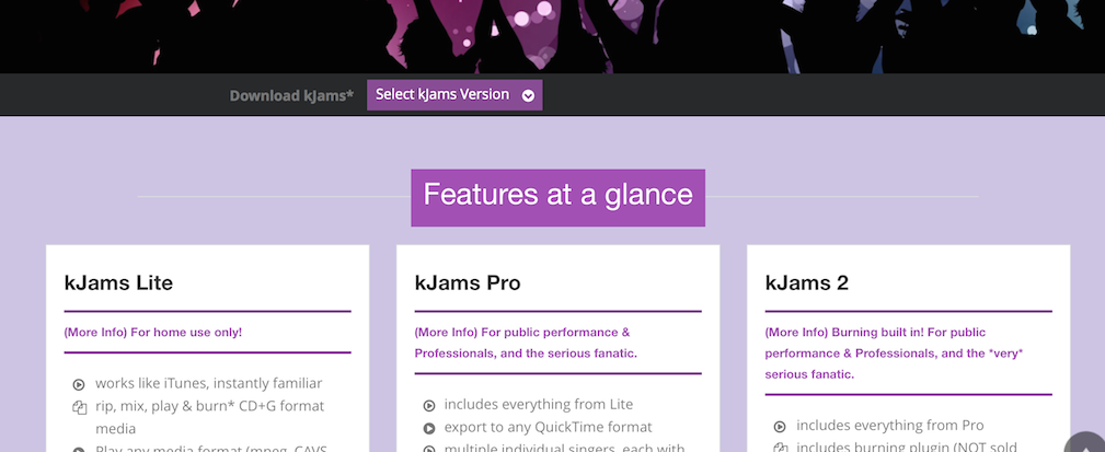
but can we do this instead?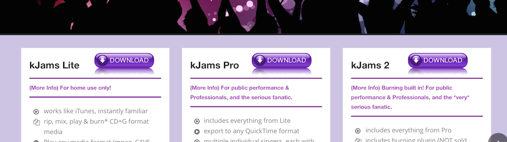
- note that the section header name "features at a glance" (above) is completely removed. i realize i asked for section header names there but i'm doing some user testing now and this is the feedback i'm getting. if you want the "download candy button" source, it is here. the button would auto-select the proper platform (mac or windows download)
- how can I easily replace background picture of main? I tried just replacing the pix in the file system but some of them seem cached and i can't get the cache to flush. there's probably a more correct way, that so i don't have to supply several sizes? do i do it from here?
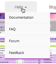
- how do i edit the links in the help menu?
- how do i edit the links in the bottom bar?

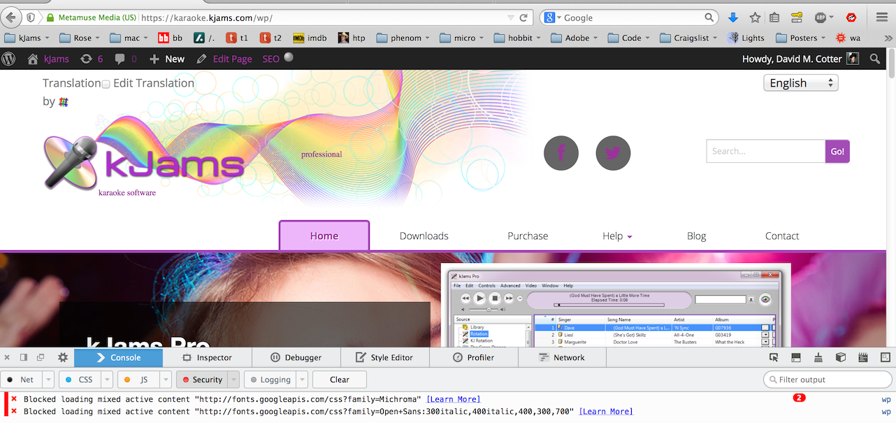
- some content is blocked because it's not being served over HTTPS ? can we fix this?
- the header still seems to take up quite a bit of real estate on a wide screen, can we squish it up more? also note the mic doesn't align with the rainbow when scrolled down
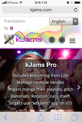
- on iPhone, site is not visually optimized. please see here for examples of good design
- update: the point is it should look like it was *designed* to look good on an iOS screen.
- update: the point is it should look like it was *designed* to look good on an iOS screen.
| Looks like this | Should look more like this |
|
|
- on iPhone, site is not visually optimized
- update2: header still takes up half the screen, background image is not resized so you can see more of pic. i see that it seems based on size of text copy of largest blurb (kjams 2), i'll cut them all down to the size of the "kJams Lite" blurb"
- update 3: you now have new copy to insert
- update 4: when the site gets iPhone sized, can we move the "translation menu" into the "☰" menu (or even just get rid of it), the point being to make the header bar as vertically small as possible, see above screenshot
- iOS still "slides" at 5 seconds, instead of "fade" at 10 seconds
- update3: hmm, this does not seem fixed on my iphone
- the rainbow graphic only aligns when the browser width is > 1200px, or when exactly about 387px. rainbow should always align. perhaps (?) make the disc logo and the rainbow just one big graphic?
- updated: still not always aligned when width < 464px
- update2: still not lining up at some widths. please take the time to resize your browser window horizontally and watch the rainbow point sometimes not touch the microphone head
- update3: it's getting better, yes, but still not there yet. there are still sizes where the point of the rainbow does not hit the tip of the microphone. so, it seems you're not actually doing your own testing? can you please just test this in Firefox by dragging the width of the browser and watching for sizes where they do not align?
- when the page width gets small, the "Tab bar" turns into a little graphic like "☰", next to the social icons. however, it "line breaks" separate from the social icons. can we make it break WITH the social icons so it does not get onto a line by itself
- updated: but it still breaks into it's own line between 465 and 529 pix
- update2: still breaks separately at smallest size
- update3: this pic was taken at 330 pix wide:
i will be testing on an iPhone (non-retina display) and will let you know my findings
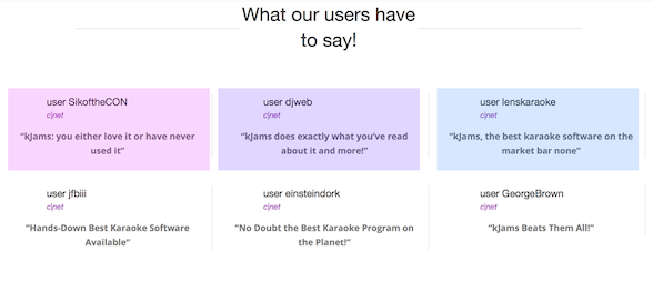
- is it possible to do an "every other" color scheme in the "what our users have to say" section? let's try a different color too, a color from within the disc logo (a blue or a green?) use your design sense
- updated: this is what i mean: so that when they all stack vertically (on iPhone) they look good
- update2: this looks fine, except the tint is not visible on iOS, which was why i requested colors in the first place :)
- update3: does not appear fixed to me.
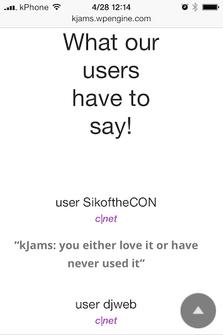
also, this is still not "optimized" for an iOS screen. The "What our users have to say!" should be one line on an iPhone
- updated: this is what i mean: so that when they all stack vertically (on iPhone) they look good
- the "home" tab does not have a "tab name" section UNDER the tab. good. all other pages do, please remove them, it is redundant.
- update: basically, remove this banner from all pages:
- update: basically, remove this banner from all pages:
- kJams logo becomes too small between 753px & 1196px, can we keep it large at those widths?
- rainbow graphic is clipped on bottom
- the rainbow graphic does not maintain it's aspect ratio
- is there a different graphic element we can use to indicate "menu" a bit better? (menu graphic is fine)
- when the page width gets small, the main section no longer shows graphics, this is fine, and the text suddenly gets a nice shaded background. i prefer that the text *always* has a shaded background
- the main section "slides" about every 5 seconds. can we get rid of the "slide" and instead make it "fade", and have the interval be ten seconds
- in the "wtkJams" section, the text "In the Paid Version:" is dark on dark. should be same color as other text
- move the "what our users have to say" section to the bottom
- in the "features close up" section, the "right-left" arrow UI elements MOVE when you click them. they must remain under the mouse and not move. can we top justify them within the current scroll view (floating at the top regardless of where you are scrolled in the current section), rather than vertical center (absolute position)
- on the "downloads" page, the graphics are different sizes vertically, which re-paginates the page when they slide, page should remain constant size
- on iPhone, scrolling the site will crash Safari
can't fix
- jumpy scroll: watch this movie to see the strange scrolling: it shouldn't do that
- update: still needs fixing
- update2: still not fixed
- update3: can't fix it without removing header bar
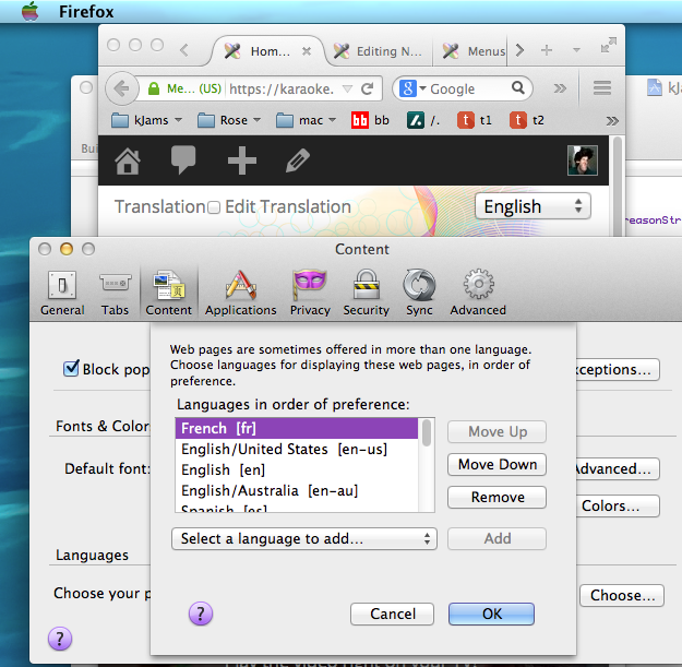
- show me how language files will work, such that when a user loads the site from germany, they will get the german language version
- updated: what i mean is, we need separate strings files (strings content separated from layout) that will be automatically dynamically loaded depending on the user's browser's language setting. this already works in the current landing page, i have hand-translated strings to replace the current ones
- update2: any update on that?
- update3: okay that works great for getting the proper hand-translated strings in there. however, my question remains: when a user from germany, who has already set their browser language to "de", will they see the page in german automatically? that's what i want, the user from another country should never have to say "i'm from this country", since the browser already knows this info (tho if the option is there to pick that is fine, perhaps just auto select it)
- update4: further testing when we have lang files
- update5: if i set my browser's language to french, the site still loads in english. i want it to automatically show the french page based on the user's already-selected language
- update6: it seems to be still not working. i set my browser language to french, then refreshed the page, but it is still in english. in the screen shot below, it shows the page still in english, and in the prefs it shows what had already been set in then language chooser AFTER i had set it there and hit refresh on the page
- update 7: still does not automatically pick the language based on browser pref